Annual Inflation since 1989
Article originally posted on https://inflationdata.com/articles/charts/annual-inflation/
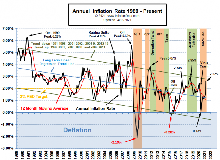
This chart plots the Current Annual Inflation Rate starting in 1989. The longer-term trend is falling. Note the declining Long Term Linear Regression line and the peak at 6.29% in October of 1990 while the Oil Peak in July 2008 was “only” 5.60% followed by successively lower peaks. Going back further (not shown) inflation peaked in March 1980 at 14.76%. Interestingly, just as we thought Inflation might break out of the channel to the upside the virus crash brought it back within the downward channel.
Is Inflation Rising or Falling?
Check this Chart to find out:
Inflation Chart since 1989
Webmasters if you would like to use any of our charts please check our usage policy.
Data Source: US Bureau of Labor Statistics CPI-U
Current Annual Inflation Commentary
Annual Inflation:
Annual inflation for the 12 months ending in March was 2.62% up sharply from February’s 1.68% and double December 2020’s 1.36%.
The current monthly inflation is 0.71%, February was 0.55%, and January was 0.43%.
March 2020 was -0.22% so that is why the Annual Inflation rate jumped up so drastically.
At 2.62%, the inflation rate is Above the FED’s target 2% rate and above the previous peak at 2.49% set in January 2020.
Previously, the FED had been concerned with a market meltdown due to falling oil prices and the Coronavirus. So, the FED embarked on a massive money creation scheme of Quantitative Easing (QE4). Although June 2020 saw a reduction in FED Assets, beginning in July the FED began gradually increasing assets again. (See FED Actions below).
Historically, if inflation climbs toward 3% the FED gets worried and this generally results in raising the FED funds rate. If inflation falls below 1% it sparks deflationary fears and quantitative easing. (Although if low inflation is the result of increased productivity it should be no cause for concern).
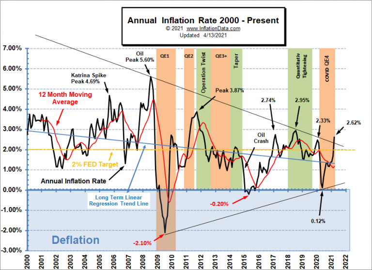
In the following chart we look at a bit shorter-term (i.e. since 2000) and we see that although in the longer-term chart above there was a downward channel since 1989, in this chart, there is more of a “Pennant” formation (i.e. less volatility centering around about 1.4%). This month we have crossed above the upper resistance of the pennant.
Note: Due to the unusual nature of the COVID deflationary pressures, the downturn in the inflation rate in April 2020 broke below the previous “pennant” support, causing a new support line to be drawn, widening the pennant point and shifting the center down.
Last month we said, “When the March and April 2021 numbers come out we could easily see a breakout to the up-side. But Congress is pushing a 1.9 Trillion stimulus package which could result in massive inflation since there is no crash at this point to absorb all that excess liquidity. The question will be if the stock market inflates or consumer prices inflate instead.”
The next hurdle is the July 2018 peak of 2.95% which we will probably surpass when the April numbers are released.
Webmasters if you would like to use any of our charts please check our usage policy.
Data Source: US Bureau of Labor Statistics CPI-U
Inflation Since 2010
At first glance, you may not notice the downtrend on the chart since 2010, but the linear regression line is still tilted slightly downward.
Typically during an election year, we can expect the FED to not try any “heavy-handed” actions because they don’t want to appear to favor either party. However, in 2020, they created a massive stimulus through Quantitative Easing (QE) by increasing “Assets”. This was due to fears of the Coronavirus and falling oil prices early in the year. Asset “creation” continued through November and fell slightly in December. Then in 2021 without deflationary pressures Congress continued to push for more “stimulus” despite the FED’s reluctance to go along. Ultimately, Congress got their way and now inflation is beginning to spike. Interestingly, FED Chairman Jerome Powell said last month that inflation was NOT a problem, perhaps in an effort to “Jawbone” inflation down contrary to the actual inflationary forces that are building.
Data Source: US Bureau of Labor Statistics CPI-U
Monthly Inflation
Typically monthly inflation is highest from January through May often in the 0.30% to 0.50% range. Monthly inflation for January 2020 was in that range at 0.39%, and in 2021 it was 0.43% so when the 2020 number was replaced with the 2021 number, annual inflation increased from 1.36% to 1.40%.
February 2021 had a monthly inflation rate of 0.55% which replaced the 0.27% for February 2020, causing the Annual Inflation rate to increase by 0.28%.
March 2019 was 0.56% and April 2019 was 0.53%. But due to the Saudi/Russia oil price war and the Corona Virus, March and April 2020 were -0.22% and -0.67% respectively resulting in a massive disinflationary environment.
March 2021 was 0.71% which replaced the -0.22% causing an almost 1% increase in the annual inflation rate. Imagine what will happen next month when the -0.67% falls out of the equation… especially if it is replaced by another 0.71%. In that case, we would see an almost 1.4% increase in annual inflation taking it up to about 4% annual inflation. We are NOT projecting quite that much but it could be close.
FED Actions
In April 2020, the FED began to fight Deflation with a massive Quantitative Easing program and near Zero Fed Funds rates and by June the FED showed signs of slacking off. But since then it has been gradually increasing assets and keeping interest rates very low. With inflation over the FED target of 2%, (and set to increase more in April), I’m not sure how they will justify their massive stimulus of 1.9 Trillion… which could trigger a HUGE spike in inflation later in the year or in 2022.
History of Quantitive Easing
The market crash of 2008 destroyed liquidity and created massive deflationary forces so the FED began fighting against deflation through traditional means and then through Quantitative Easing. Then in November 2015 the FED switched sides and began slowly raising interest rates to fight against Inflation. From there, inflation rose from July 2016 – February 2017 convincing the FED that it was safe to raise rates a bit more aggressively. On March 15, 2017, the Fed voted to raise its benchmark FED-funds rate by a quarter percentage point, to a range of 0.75% to 1% on the assumption that inflation was building (and because they were desperate to raise rates so they would have somewhere to go in the next recession). At its June 2017 meeting, they decided to raise it by another quarter percentage point bringing the benchmark rate to a (1.0% to 1.25%) range. Those were their target ranges.
Throughout 2018 the FED followed a policy of Quantitative Tightening (QT) in addition to raising the FED Funds rate that they charge banks. QT is the opposite of Quantitative Easing. In “Quantitative Easing” (QE) the FED acquired government debt by buying it on the open market. QT is a process whereby the FED reduced the debt that it held by not renewing Federal Debt when it matures.
According to the National Bureau of Economic Research (NBER), the U.S. has been in a recession since February 2020 (shaded area) after the longest boom in economic history. According to NBER, the peak occurred in February 2020. Since that was the peak, as the economy slides down the other side, often it will take a while before people realize that things are not going as well as it was at the peak. Of course, this time people are attributing the slide to COVID rather than a normal slowing of the economy.
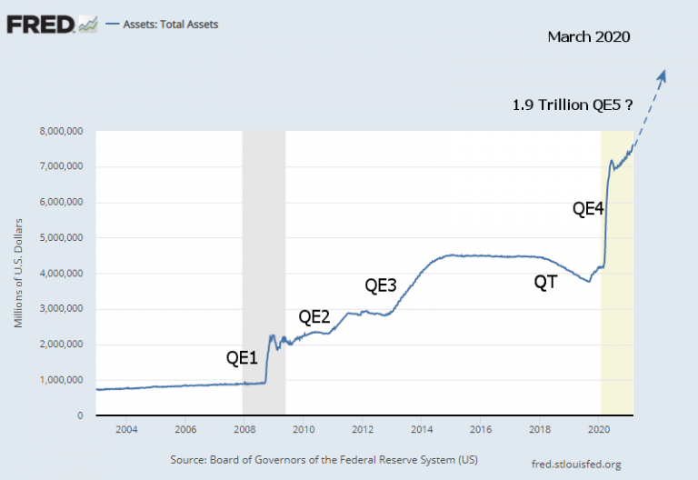
After the massive QE increase beginning in March, the FED tried tightening from June 10th through July 8th, 2020. That small QT caused concern among many market analysts but then the money began flowing again… as we saw a progressive increase through year-end. See NYSE ROC for more info.
Data Source: Federal Reserve Total Assets.
If we take a longer-term view we can see the size and frequency of the previous Quantitative Easings, each of which created a progressively larger jump in FED assets. QE1 took FED assets from below 1 Trillion to over 2 Trillion. By the end of QE2 FED assets were almost 3 Trillion. QE3 took it to 4.5 Trillion and then the FED tried tightening bringing assets slightly below 4 Trillion. But then along came QE4 and FED assets jumped straight to over 7 Trillion… growth slowed for a bit and then steadily climbed above 7.5 Trillion.
If we add another 1.9 Trillion as Congress is currently contemplating that will take FED Assets to around 9.4 Trillion… almost 10 times what it was in 2008. Although previous “Easings” have not resulted in massive inflation, that is primarily because the effects were directed toward massive monetary collapses (stock market). If there is no collapse will the money go into consumer goods (raising prices for food, gasoline, etc.) or the stock market or both?
Currently, FED assets are primarily composed of 2.18 Trillion in Mortgage-Backed Securities, and 4.96 Trillion in U.S. Treasury Securities. Source: St. Louis FED
Federal Funds Rate
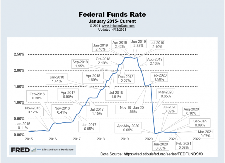
In the chart below, we can see that the FED Funds Rate peaked at 2.42% in April 2019 then the FED began fearing that it was holding too tight and the stock market was suffering so it began easing. It leveled off in November at 1.55% where it stayed until February. At that point, COVID tanked the market, and the FED loosened rates to virtually zero (actually 0.05%) five one-hundredths of a percent. In June they moved it up to eight one-hundredths of a percent and then in July, it inched up another one-hundredth of a percent. Then in August, it moved up another one-hundredth of a percent to 0.10% (i.e. one-tenth of 1%). Interestingly, even that was too high because they lowered it in September back to 0.09% where it remained through January 2021. In February the FED lowered the FED Funds Rate to 0.08% and in March they lowered it further to 0.07%.
Data Source: Board of Governors of the Federal Reserve System (US)
See: Inflation Expectations and the Massive Fed Stimulus and Will the $2 Trillion Covid-19 Stimulus Cause Inflation? For a discussion on how this affects the stock market see: NYSE Rate of Change Commentary.
Previously the FED…
From the chart above, we can see that FED interest rates “stair-stepped” up throughout 2017 and 2018 and from February 2016 through January 2019 it increased six fold. The FED raised its Federal Funds Rate almost a full percentage point from January 2018 through January 2019 from 1.41% to 2.40%. By the fourth quarter of 2018, the markets got spooked due to the combined raising interest rates and Quantitative Tightening (QT) that occurred during 2018 and the FED promised to curb their “tightening” at that point it only included FED Funds Rate since QT has continued through September 2019.
The FED Funds rate leveled off, for the first half of 2019. After July, the FED lowered the FED Funds rate significantly falling from 2.40% in July to 1.55% in November. The FED held the FED Funds rate steady at 1.55% from November through January, increasing very slightly to 1.58% in February.
How to Read the Annual Inflation chart:
The black wavy line represents the actual annual inflation rate as calculated from the Consumer Price Index (CPI-U) published by the U.S. Bureau of Labor Statistics. Each month the oldest month drops out of the calculation and a new month is added.
The CPI creates a standard to compare against to help us determine the real purchasing power value of a Dollar because the level of prices is constantly changing due to increases (or decreases) in the money supply.
The red line is a 12-month moving average, meaning it is the average of the annual inflation rate as measured during the last 12 months. If the red line is pointing up we are in an inflationary trend. When the red line is pointing down we have “disinflation” i.e. prices aren’t increasing as fast as they were before and when the black line falls below zero that is deflation (prices are actually falling).
If the inflation rate is simply trending down we call it “disinflation”. An example of disinflation would be if the annual inflation rate is 3.2% the first month, 3.0% the second month and 2.8% the third month.
If disinflation continues and the inflation rate crosses below 0%, we turn from inflation to deflation since by definition “deflation” is a negative inflation rate. This is a relatively rare event, the last time that happened (before 2009) on an Annual Basis (prices were lower than a year ago) was in 1955, although we have had deflation for a single month on a more regular basis (where prices fell compared to the previous month).
By definition, whenever a line crosses through its moving average a change in direction is indicated. So when the black line crossed up through the red line in August of 2002 that indicated that inflation was no longer falling (disinflation) but was now in an uptrend (inflation).
The yellow long term trend line indicates we had been in a downtrend since the peak in 1990. The key point came in June of 2004 when the index crossed above the yellow line confirming the end of the inflation downtrend. So although the short-term downtrend ended in August 2002 the long-term disinflationary trend ended in June of 2004.
At 0% inflation, the general level of prices of a basket of goods and services would stay the same from year to year.
Monthly Inflation:
We have to remember that typically the months of January through May are highly inflationary, June through September are moderately inflationary and October through December produce the lowest increase in prices and are often even deflationary. However, in January 2019 we only had 0.19% monthly inflation compared to 0.54% in 2018 and 0.58% in 2017. Typically 90% of the Annual inflation occurs from January- May. The months of June through September are moderate and then October- December actually erases some of it (through disinflation).
As we can see from the table below, if June – August 2021 come in very moderate we could see annual inflation drop a bit since 2020 numbers were considerably higher than average.
Monthly Inflation Table:
| Month | 2017 | 2018 | 2019 | 2020 | 2021 |
| January | 0.58% | 0.54% | 0.19% | 0.39% | 0.43% |
| February | 0.31% | 0.45% | 0.42% | 0.27% | 0.55% |
| March | 0.08% | 0.23% | 0.56% | -0.22% | 0.71% |
| April | 0.30% | 0.40% | 0.53% | -0.67% | |
| May | 0.09% | 0.42% | 0.21% | 0.002% | |
| June | 0.09% | 0.16% | 0.02% | 0.55% | |
| July | -0.07% | 0.01% | 0.17% | 0.51% | |
| August | 0.30% | 0.06% | -0.01% | 0.32% | |
| September | 0.53% | 0.12% | 0.08% | 0.14% | |
| October | -0.06% | 0.18% | 0.23% | 0.04% | |
| November | 0.002% | -0.33% | -0.05% | -0.06% | |
| December | -0.06% | -0.32% | -0.09% | 0.09% |
Inflation was very low in 2016 (and even lower in 2015). The FED targets a 2% annual inflation rate and 2017 hovered around that level.
Annual Inflation Table:
| Month | 2017 | 2018 | 2019 | 2020 | 2021 |
| January | 2.50% | 2.07% | 1.55% | 2.49% | 1.40% |
| February | 2.74% | 2.21% | 1.52% | 2.33% | 1.68% |
| March | 2.38% | 2.36% | 1.86% | 1.54% | 2.62% |
| April | 2.20% | 2.46% | 2.00% | 0.33% | |
| May | 1.87% | 2.80% | 1.79% | 0.12% | |
| June | 1.63% | 2.87% | 1.65% | 0.65% | |
| July | 1.73% | 2.95% | 1.81% | 0.99% | |
| August | 1.94% | 2.70% | 1.75% | 1.33% | |
| September | 2.23% | 2.28% | 1.71% | 1.37% | |
| October | 2.04% | 2.52% | 1.76% | 1.18% | |
| November | 2.20% | 2.18% | 2.05% | 1.17% | |
| December | 2.11% | 1.91% | 2.29% | 1.36% |
So where does that leave us? Inflationary forces were building or at least returning to “normal” in 2016 but the trend in 2017 was more questionable. Then throughout 2018 the FED pursued a policy of higher interest rates and retiring debt (i.e. Quantitative Tightening) which began reducing inflation in mid-2018 but also sent the Stock Market tumbling in the 4th quarter of 2018. In 2019 inflation was in almost the perfect range (if any inflation can be considered “perfect”). But inflation began ticking up in late 2019 and early 2020 until the Oil Price War and the Coronavirus crashed the stock market and took inflation to near zero. In 2021 inflation spiked up in March…
See:
- America & Money: Cool Facts About the History of Our Monetary System
- The U.S. Economy, Payrolls & FOMC
- Is a Second OPEC Cut In The Cards?
- Are Oil Production Costs Rising or Falling?
Calculating the Current Inflation Rate
If we compare July 2018’s cpi index which was (252.006) with July 2019 (256.571) we can see a 4.565 point increase in the 12 month period. 4.565 / 252.006=0.018114 which when rounded to 2 decimal places and converted to a percentage equals 1.81% annual inflation.
Monthly Inflation/Deflation:
See monthly Inflation for a table of all the individual months since 1913.
2015 was Deflationary
The months January 2015 through May 2015 plus again in September ended with annual deflation.
| Month | Annual Deflation |
| January | -0.09% |
| February | -0.03% |
| March | -0.07% |
| April | -0.20% |
| May | -0.04% |
| September | -0.04% |
Note that the BLS rounded some of these months to 0.0%. Also worth noting: Annual deflation for the first five months of 2015 was primarily due to lower gasoline prices rather than a lack of FED money printing although the FED had tapered it’s “Quantitative Easing” program. One major issue remains, i.e. the low Velocity of Money which has resulted in a low money multiplier and consequently a low inflation rate.
| Month | Annual Inflation / Deflation | CPI Index |
| June | 0.12% | 238.638 |
| July | 0.17% | 238.654 |
| August | 0.20% | 238.316 |
| September | -0.04% | 237.945 |
| October | 0.17% | 237.838 |
| November | 0.50% | 237.336 |
| December | 0.73% | 236.525 |
June through December saw inflation increase with the exception of the year ending in September which was slightly deflationary again. Interestingly, the CPI index peaked in August and then fell steadily from September 2015 through December 2015 from 237.945 to 236.525 but annual inflation rose. That is because October, November, and December 2014 were more deflationary than October, November, and December 2015 so as each month’s rate was replaced the ANNUAL inflation rate rose even though the monthly inflation rate was negative (but less negative than the previous year).
Note the 2% dotted line on the chart which signifies the FED “target”. According to policy, the FED is targeting a 2% inflation rate. As we can see from the chart over the last 25 years they have hit the target a total of 6 times out of more than 300 data points. If we count all the times they crossed the target or even got close we get a total of about 25 or less than 8% of the time. This lends credence to the idea that the FED has less control over inflation (and even deflation) than they would like us to believe.
The overall trend since 1990 has been down with a few brief periods of higher inflation. The chart shows the annual inflation rate from 1989. The rate peaked in October 1990 at 6.29% from there it trended down until it bottomed just above 1% in 2002. Inflation increased from there to peak at 5.6%in 2008 just before the crash which took it down to a deflationary -2.10%.
The FED’s Quantitative easing pumped inflation back up to 3.77% by 2011. But Operation Twist and QE3 did not result in additional inflation and instead rates returned to the 1% level.
However, as prices were beginning to climb again in 2014 the price of oil came crashing down. Common wisdom has it that in order to flush out shale oil and alternatives like Solar and Wind. But is this really the cause of the oil glut? And will the new deal with Russia eliminate it? See The Truth About the Russia-Saudi Oil Deal for more information.
Cost of Gas:
One of the major factors in Consumer Price Inflation is the price of energy primarily gasoline for their vehicles but also heating oil, and Electricity (which is also dependent on oil prices).
| January 2013 | $3.29 |
| January 2014 | $3.31 |
| January 2015 | $2.08 |
| January 2016 | $1.87 |
| January 2017 | $2.33 |
| January 2018 | $2.52 |
| February 2018 | $2.57 |
| March 2018 | $2.52 |
| April 2018 | $2.66 |
| May 2018 | $2.84 |
| June 2018 | $2.91 |
| July 2018 | $2.88 |
| August 2018 | $2.87 |
| September 2018 | $2.84 |
| October 2018 | $2.67 |
| November 2018 | $2.69 |
| December 2018 | $2.41 |
| January 2019 | $2.24 |
| February 2019 | $2.27 |
| March 2019 | $2.49 |
| April 2019 | $2.78 |
| May 2019 | $2.87 |
| June 2019 | $2.72 |
| July 2019 | $2.76 |
| August 2019 | $2.64 |
| September 2019 | $2.57 |
| October 2019 | $2.64 |
| November 2019 | $2.60 |
| December 2019 | $2.57 |
| January 2020 | $2.58 |
| February 2020 | $2.44 |
| March 2020 | $2.36 |
| April 2020 | $1.88 |
| May 2020 | $1.85 |
| June 2020 | $2.09 |
| July 2020 | $2.20 |
| August 2020 | $2.18 |
| September 2020 | $2.20 |
| October 2020 | $2.18 |
| November 2020 | $2.13 |
| December 2020 | $2.16 |
| January 2021 | $2.31 |
| February 2021 | $2.48 |
| March 2021 | $2.81 |
| April 2012 | $2.86 |
Gas Prices Source: AAA
The retail cost of Gasoline (Regular) averaged $3.29 nationwide in January 2013, then increased to $3.77 in February. By January 2014 the nationwide average price for regular gasoline was back down to $3.31 almost identical to January 2013 then it increased again to $3.64/gallon in April 2014 with Premium averaging just under $4.00 nationwide.
But by January 2015 the nationwide average had fallen to $2.08 with some localities registering prices below $2.00/gallon. In February 2015 gasoline prices across the country had ticked up again slightly and were averaging $2.343/ gallon.
In January 2016 the nationwide average was $1.87 and it fell to $1.71 in February but rose to $1.96 in March. Of course, prices vary widely across the country due primarily to the imposition of state taxes on gasoline. For instance, California imposes 38.13 cents per gallon taxes on gasoline in addition to the federal 18.4 cents per gallon tax while many other states impose less than 20 cents per gallon.
In January 2017, several states adjusted their highway taxes Pennsylvania already had the largest gas tax in the country, at 50.4 cents per gallon, but they increased it another 7.9 cents per gallon on January 1st to 58.2 cents per gallon.
We have published several articles on how the Oil price is affected by the petrodollar but gasoline prices are also affected by state and federal highway taxes. Historically Democrats have pushed for an increase in the 18.4 cents per gallon federal highway tax which funds the Highway Trust Fund, the primary source for funding federal highway and transit programs. This would increase the price that you pay at the pump not just while gas prices are low but even if gasoline prices returned to previous higher levels.
See:
- Death of the Petrodollar
- Total War over the Petrodollar
- More on the PetroDollar
- The current map of gas prices by county
- Gasoline Taxes by State
Annual Inflation:
Inflation in 2014
2014 began with 1.58% annual inflation in January rising to 2.13%% in May. Although monthly inflation for the first two months was 0.37% each, at 0.64% March had almost as much inflation as the previous two months combined and settling back down to 0.33% in April and 0.35% in May. But annualizing that rate would still result in 4.20% annual inflation, while annualizing March’s rate would result in a whopping 7.68% total inflation for the year. Fortunately, the first quarter is usually the highest and then typically inflation decreases and often ends in deflation in the last quarter of the year. Monthly inflation was negative (disinflationary) every month from July through November except September when it was slightly inflationary 0.08%.
Inflation in 2013
2013 started at 1.59% then had a low of 1.06% in April with highs in February and July of 1.98% and 1.96% respectively. September fell back to 1.18% and October fell to a new low of for the year of 0.96%. November bumped up a bit to 1.24% and December finished the year at 1.50% not far from where it started.
See 2012 – 2013 Inflation Recap for more information.
Quantitative Easing (and Inflation)
On November 25, 2008, the Federal Reserve announced that it would purchase up to $600 billion in agency mortgage-backed securities (MBS) and agency debt. This was the beginning of the Quantitative Easing program and later called QE1.
In December the FED cut interest rates to near Zero.
In March 2009, the FED announced that it would purchase another $750 Billion in junk mortgages (Mortgage Backed Securities) and $300 Billion in Treasury Securities primarily because the rate of inflation was still heading down.
Often there is a lag in the effects of money creation but as QE1 ends the inflation rate once again begins dropping, spending much of 2010 at just over 1%.
So the FED decides QE2 is necessary and this time it purchases another $600 Billion of Longer-Term Treasury Notes. The inflation rate increases to almost 4% but when QE2 stops the inflation rate begins falling again. Personally, I would love to see the inflation rate stay between 1 and 2% or better yet between 0% and 1%. In the long-run steady low inflation rates benefit everyone as people can accurately judge their future costs and make sound business decisions. But the government prefers a higher inflation rate so it can repay its debts with “cheaper dollars.” Inflation also erodes savings and causes consumers to act imprudently and spend more than they would if they had sound (unchanging) money. This is what the government means by “stimulating the economy” i.e. causing people to spend more than they would prudently do otherwise. The obvious long-term effects are a society with more debt than it should have and thus we see crashes like we saw in 2008. Then the government has to “do something” so it prints more money to fix the problem it created by printing money in the first place. For more detail see: Stimulate the Economy? Please Don’t!
On September 21, 2011, the Federal Open Market Committee announced Operation Twist.
On September 13, 2012, the FED announced QE3 which was $40 Billion a month in purchases, and on December 12, 2012, they announced an additional $45 Billion per month with no definite end in sight.
We’ve added QE1, QE2, Operation Twist, and QE infinity to the chart so that you can see the effects on the inflation rate. These “Quantitative Easings” were not your typical FED money-printing schemes. In QE1, which lasted from November 25th, 2008 – March 31, 2010, the FED started by purchasing $500 Billion in Mortgage-backed securities. Most of these securities were virtually worthless at this point. But just a few months earlier they were considered part of the larger money supply. So in effect, the FED bailed out the owners of this junk debt and pumped up the money supply at the same time by converting worthless junk into “valuable” greenbacks.
In December Ben Bernanke began “tapering” which slowly shut off the flow of easy money and by October 2014 the flow was totally stopped.
In our video What is the Real Purpose of the Federal Reserve? Edward Griffen reminds us that the Federal Reserve is really just a bank cartel and it primarily has its member’s interests at heart. So monetizing worthless junk paper and bailing out the banks that held them makes perfect sense when looked at in that light. Operation Twist was announced on September 21, 2011, and it was designed to buy long-term Treasury notes on the open market while simultaneously selling short-term notes. This would have the effect of driving long-term interest rates down. Theoretically, this should have helped mortgage borrowers better be able to afford new homes (but more importantly to the bank cartel) boost the demand for loans and the bank’s profit margins. To some extent, this has happened but probably not to the extent that they had hoped.
Note:
Here at InflationData.com, we like to take our inflation numbers straight with as little adjustment as possible so we only look at the non-adjusted numbers. So often you will hear different numbers quoted in the popular media because they usually use the “Seasonally Adjusted” numbers.
Many people believe that the “Official Government numbers” are fudged. See Can We Trust Government Inflation Numbers? and Is the Government Fudging Unemployment Numbers? and Employment vs. Unemployment for more evidence the Government is fudging the Unemployment numbers.
Monthly Inflation:
By looking at the monthly inflation rate we can see the various components that make up the annual inflation rate.
The annual inflation rate is made up of the 12 most recent monthly rates. So when a small or negative (deflation) monthly rate is replaced by a large positive monthly rate we can see a significant jump in the annual inflation rate in a single month. Conversely, if a large monthly inflation rate is replaced by a smaller one, inflation will decrease.
For instance, February 2014 had a monthly inflation rate of 0.37% which was replaced by a 0.43% rate for February 2015 so the Annual inflation rate stayed virtually the same as it was the previous month i.e. Annual inflation (actually deflation) went from -0.09%. in January to -0.03% in February.
But the month before (in January 2015), we saw a fairly large 0.37% monthly rate for January 2014 be replaced by a deflationary -0.47% for January 2015 which was enough to shift the Annual inflation rate from 0.76% in December 2014 to -0.09%. in January 2015.
See the current MIP to read more about what we are predicting for next month and the next year. See the Misery Index for the combined effect of Unemployment and Inflation.
You may also be interested in knowing how to Calculate the Inflation Rate. Or you can simply use our Inflation Calculator to do the calculations for you. More Inflation Calculators.
To calculate how much purchasing power you would lose at other rates go to our Compound Inflation Calculator aka. Retirement Planning Calculator and you can see how devastating 6% or 10% can be to your retirement nest egg.
Complete list of monthly inflation rates since 1913
How much do you need to earn next year to keep up with inflation? See our Salary Inflation Calculator to find out.
Other Articles:
- Stock Market- Stock Trends by Month
- Rising Food Prices- Agflation- What is it?
Velocity of Money:
Inflation History-The Big Picture:
In mid-2002, at the depth of the recession, after registering a new low of just over one percentage point (1.07%), the inflation rate crossed back up through its moving average, indicating that the disinflationary period had ended and inflation was increasing again.
From there the inflation rate began a 6 year uptrend, with consumer prices generally increasing primarily due to the central bank increasing the money supply.
The one exception to this monetary policy caused increase was a supply disruption due to hurricane Katrina (Katrina Spike) which was promptly followed by a corresponding decline in the inflation rate bringing the average level of inflation over a slightly longer period back within the upward trend. Following the Katrina spike was the oil spike. This may also have brought the inflation rate to an artificial high (i.e. not based on monetary factors but supply factors) so as oil prices fell back to reality the inflation rate also began falling (disinflation), in order to return the system to balance around the linear regression line.
The blue trend-line is called a “Linear Regression” line and it shows the trend over time for the entire period. A linear regression line mathematically divides the chart so that exactly half the volume is above the line and the other half is below.
As we can see, the trend over the period of this chart (since 1990) is declining slightly (the Blue line is tilted downward).
We can also see the relationship between a rise in the prices of food and energy as oil prices drove the inflation rate up to a peak of 5.6% in mid-2008 and then as the Oil bubble burst it started the downward trend.
Finally, the housing market and the stock market crashed reducing the money supply, creating a liquidity crisis thus plunging us into a period of deflation where prices were actually lower than the year before, reaching a deflationary low of -2.1% in July of 2009.
Since then Inflation blipped up as a result of the Trillion dollar stimulus but then began slowly falling. Along came QE2 the second of Bernanke’s monetary stimuli and inflation picked up again and crossed above its moving average and above the blue linear regression line and took it out of the downtrend channel and began heading upward again. So July 2009 at -2.10% may have been the turning point and the bottom of the downtrend. For more information See: What is Quantitative Easing?
The average annual inflation rate for the entire period since 1913 has been 3.15% per year. (Using Geometric Mean). For more information on the Geometric Mean see: Inflation by Decade.
See Current Commentary above for an explanation of what this chart is telling us about inflation now.
See the current MIP to read more about what we are predicting for next month and next year. Remember our projections are based upon sound mathematical formulas not on simply extending the current trend forever.


